




Paint Color Catalog: How to Pick the Right Room Shade
How do you read a paint color catalog? Why does a swatch shift under different light, how is the code verified and how should you test a shade before buying?
The shade you liked on a swatch turning out completely different on the wall is the most common disappointment in choosing paint. The problem usually lies not in the color itself but in the way the swatch is read: a small piece of paper is seen under store lighting, while the wall is seen in the light of your own home. In this article we explain how to read a paint color catalog correctly, how to verify the code and how to run the test that brings the risk close to zero before you buy.
Key Takeaways
- A swatch is not the identity of a color but a starting point; the decision is made on the wall, in your own light.
- Always note the color code: the same shade may appear under a different name in different charts, while the code stays fixed.
- Sheen changes the color; a matt shade applied in satin looks a few degrees darker and more saturated.
- The chart of effect and textured products is not read like a flat color chart; there you are not choosing a color but the relationship the surface builds with light.
- The only correct test method: the real product, two coats, at least A4 size, on two different walls of the room.
What Does a Color Catalog Actually Show?
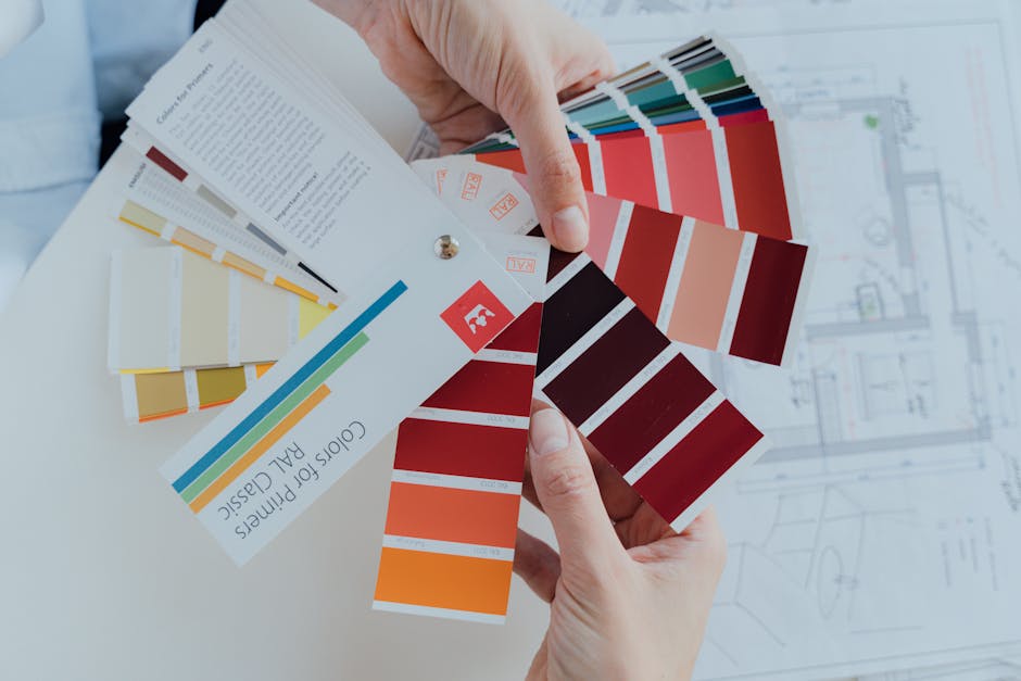
A paint color catalog is a reference in which the shades the manufacturer can produce ready-made in its tinting system are sampled. Each patch corresponds to a code, and that code determines which base and which pigment ratio the paint will be prepared with. So the function of a chart is as much to "make the color repeatable" as to "show the color": when you need to renew part of the same wall six months later, what you must have in hand is a code, not a name.
That is why the first rule in color selection is simple: write down the code of every shade you like. Names such as "cream", "sand" or "beige" cover a very wide range in everyday language; two shades carrying the same name in two different charts can differ visibly. On the our color charts page the shades are listed together with their codes; when you make your decision through the code, no ambiguity is left either in communication or in the order.
Light: The Real Difference Between Swatch and Wall
The same paint looks cold and gray in a north-facing room and warm and light in a south-facing one. Under a bulb in the evening it sits somewhere else entirely. The mistake we come across most often in practice is choosing the color under store lighting and living with it at home.
A practical approach according to the orientation of the room is as follows:
| Room orientation | Character of the light | What to watch in the color |
|---|---|---|
| North | Cold and unchanging | Cold grays turn even colder; colors with a slightly warm undertone restore the balance |
| South | Strong throughout the day | Light shades become even lighter; a shade one degree more saturated holds steadier |
| East | Warm in the morning, neutral in the afternoon | Two different appearances in the two halves of the day; look at both |
| West | Very warm in the evening | Shades leaning toward yellow can look exaggerated in the evening |
Artificial lighting is just as decisive. Warm white bulbs bring out yellow and red undertones, cool white bulbs bring out blue. If you use your living room in the evenings, judging the color in evening light makes more sense than judging it in morning light. On the Living Rooms page we addressed the balance of texture and color according to how the room is used.
How Does Sheen Level Change the Color?
The patches in the catalog are usually printed at a single sheen, while the product can be applied as matt, silk matt or satin. The same code looks more saturated and slightly darker in a glossier product, because a glossy surface reflects light instead of scattering it and the color of the pigment reads more clearly. Matt surfaces refract the light, fade the color a notch, but hide the defects of the wall.
The practical result: if you have chosen a matt product for the bedroom, consider a shade one degree more saturated on the chart; if you have chosen a satin product for the kitchen, consider a shade one degree lighter. The sheen levels of the products are defined in the TDS on the interior paints and primers page.
A Flat Color Chart and an Effect Chart Are Not the Same Thing
Silkcoat charts fall into two groups and the two are read differently:
- Flat color charts — the Interior and Exterior charts. Here each patch represents a single shade and is ordered directly through the code.
- Effect and texture charts — the charts of products such as Marmarito, Metalico, Velvetto, Cashmere, Pearl, Travertino and Prestige. On these products the surface is pearlescent, velvet-textured or stone-look; the color changes with the angle at which the light arrives. What you choose on these charts is not a "hex value" but the relationship the surface builds with light.
With effect products it is almost impossible to decide by looking at a small patch, because the pattern scales together with the application technique. For these products always ask for a full-size application sample or watch the application videos to see how the texture moves.
Before You Buy: The Right Color Test
A color test always stays cheap next to painting the whole house in the wrong color. The steps are these:
- Take a sample of the real product. There can be small differences between the printed color of the chart and the color of the tinted paint; the decision should be made with the paint itself.
- Apply it on a primed surface. A light color brushed directly over an old dark wall does not show its true shade.
- Apply two coats. A single coat misleads the color assessment because the film thickness remains insufficient.
- Test at least A4 size and on two separate walls. The wall near the window and the wall opposite it show the same color differently.
- Wait 24 hours and look at three different times of the day. Morning, afternoon and evening under artificial light.
- Judge it together with the color of the furniture and the floor. A color does not work on its own but within the whole of the room.
The Rules of Color Selection Are Different on the Facade
On the facade, color is as much a matter of durability as of aesthetics. The sun tires dark and saturated shades faster than light ones; a dark facade also raises the surface temperature and puts the coating through more expansion-contraction cycles. The texture of the building, the neighboring structures and, where they exist, local architectural rules also limit the choice.
When you make the decision on the facade, look at the chart in daylight under natural light, standing in front of the building; colors chosen indoors and applied outside almost always look lighter than expected. On the product side the choice is not only a matter of color but of binder and additives; the silicone-modified and elastic options within exterior paints and primers answer different facade problems.
Common Mistakes
- Choosing the color only under store lighting.
- Noting the name instead of the code, and having to say "that cream shade" when ordering.
- Looking at a small patch and deciding on an entire wall — a color is perceived as more saturated as the area grows.
- Choosing effect products as if they were flat colors and not taking the texture into account.
- Forgetting the ceiling and the joinery; the wall color forms a whole not on its own but together with them.
- Running the test without primer, in a single coat and over an area the size of a palm.
Wall, Ceiling and Joinery: Building the Triple Balance
The color decision is not made with the wall alone. A room consists of three surface groups, and the relationship between them determines how the chosen shade will be perceived. Finishing the ceiling in the same shade as the wall lowers the space and makes it feel tighter; a ceiling one degree lighter than the wall increases the height. Joinery surfaces such as doors, windows and skirting boards define the lines of the room: when they are painted in the same shade as the wall the space becomes calmer and wider, when they are painted in a contrasting shade the architectural detail comes forward.
A practical method is to look at the neighbor one below and one above the main shade you have chosen on the chart. Shades placed in the same column come from the same pigment family and are therefore automatically in harmony with one another; giving the wall the middle shade, the ceiling the lighter shade one above and the joinery, if contrast is wanted, the shade one below produces a balanced result.
Surfaces such as skirting boards and doors are at the same time the most frequently touched areas. That is why the washability of the product is as decisive there as the color; a satin finish on the joinery, together with a matt finish on the wall, works well both visually and in terms of maintenance.
Conclusion: Start with the Code, Finish on the Wall
A good color choice is secured by two things: reading the code correctly on the chart and making the decision on your own wall, in your own light. When these two are done, the sentence "it looked different on the chart" disappears.
The concrete next step: open the chart that suits your space from our color charts page, settle on no more than three codes and test these three shades from the real product, in two coats, on a primed surface. Once you have decided, look at the product's technical data sheet on the TDS page and calculate the consumption and the number of coats.
Each patch corresponds to a color code, and the code determines the tinting formula of the paint. Always note the code instead of the color name; the name can change between charts, while the code stays fixed and is the only reliable reference when ordering.
The chart is seen under store lighting, while the wall is seen in the natural and artificial light of your room. A color is also perceived as more saturated as the area grows. That is why the decision should be made on a two-coat test applied to the wall, not on a small piece of paper.
Take a sample of the real product and apply it on a primed surface, at least A4 size and in two coats. Test it on two different walls of the room, wait 24 hours and look at it separately in the morning, in the afternoon and in the evening under artificial light.
Yes. The same code looks more saturated and a notch darker in a satin product and paler in a matt one. If you have chosen a matt product, looking at a shade one degree more saturated on the chart gives the right result; if you have chosen a satin product, look at a shade one degree lighter.
Yes. On products such as Metalico, Velvetto and Marmarito the surface is pearlescent or textured and the color changes with the angle of the light. A small patch does not show the texture to scale; with these products you need to see a full-size application sample.
Look at the color in front of the building, in daylight under natural light; shades chosen indoors look lighter on the facade. Dark and saturated shades tire more under the sun and raise the surface temperature. Neighboring structures and local architectural rules can also limit the choice.
Yes, as long as you keep the color code. Note the code on the paint tin or in your phone. With requests made only by color name, matching exactly the same shade may not be possible.
Light colors with a slightly warm undertone make the space look airy; very cold grays can feel dull in small rooms that receive little light. Keeping the ceiling one degree lighter than the wall makes the height more noticeable.
Tags