
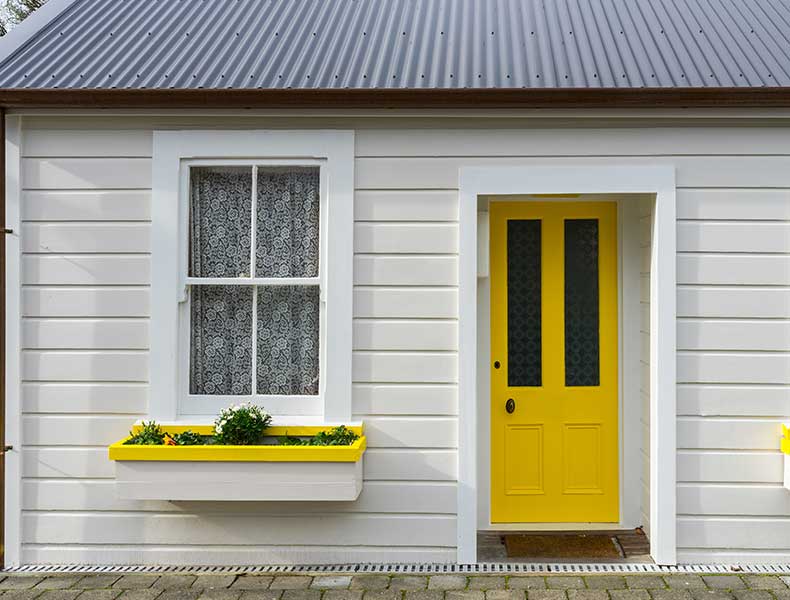

Guide to choosing exterior paint colors and patterns
Learn how to choose exterior paint colors and patterns according to architectural style, climate and maintenance needs, and discover the most harmonious combinations for your home step by step.
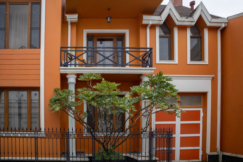
Color and pattern on exteriors: Start by knowing what you choose and why
When choosing exterior paint, most people can’t decide between “white, gray or stone effect?” As much as color, pattern and texture also change the building’s character, maintenance needs and how it’s perceived from the street. Moreover, when you use the same color in a flat paint, a textured coating or a stone-effect coating, the result is completely different.
This article examines exterior paint colors and the most preferred patterns together with architectural style, climate and maintenance needs. You can see step by step which color–pattern combinations are most commonly used in detached houses, villas, residential complexes or apartment blocks and what will suit your building.
Highlights
- On exteriors, “pattern” is not just a color difference; it is the sum of texture, grain and light play.
- The most preferred colors are white, cream, gray and nature tones; dark colors are used in limited areas for emphasis.
- Textured, stone-effect and roller-patterned coatings give both protection and character, especially on ground floors and corner areas.
- Climate, façade orientation and surrounding buildings play a critical role in the light–dark balance and pattern selection.
- When deciding, working with a color chart, small test areas and sample combinations reduces the risk of error.
What do “color” and “pattern” mean on exteriors?
On exteriors, color is not only the question of “white or gray?”; hue, lightness–darkness and the warm–cool balance determine the psychological impact of the building and how it is perceived from a distance. Pattern is not just a two-dimensional motif; it is the combined result of surface texture, grain size and the shadow created when light hits the surface.
In practice, we speak of the following components on exteriors:
- Color hue: White, cream, beige, gray, earth, green, blue etc.
- Lightness–darkness: Light, medium and dark tones of the same color.
- Warm–cool character: Colors perceived as warm such as cream, beige, earth tones; and cooler ones such as gray, blue, greenish tones.
- Flat or textured surface: There is a noticeable difference between flat matt paints (e.g. Silicone, Acrylic, Hydroclean) and textured or stone-effect coatings (e.g. Acrycoat, Silkoterasit, Stone).
- Application pattern: Line and direction differences given by roller, trowel, brush or spray (e.g. Elasticoat Desenli, Ruloser range).
The following are common in terms of color psychology and perception from the street:
- Light and neutral tones (white, off-white, light gray, cream): Make buildings appear larger and more spacious, and easily harmonize with most architectural styles.
- Medium nature tones (stone, sand, earth tones): Blend better with the surroundings and show dirt and dust less than light tones.
- Dark accent tones (anthracite, dark gray, navy, dark green): When used on the entire façade they create a dominant, even aggressive effect, but when used on selected accents they create a modern and balanced look.
Pattern and texture create constant small light–shadow plays on the façade, especially as the sun moves throughout the day. The most common mistake in practice is deciding only by looking at the color code without taking texture into account. The same beige tone may look simple and calm in a flat paint but much more lively and dynamic in a textured coating.
Most preferred exterior colors: Neutrals, nature tones and characterful accents
The most commonly chosen exterior colors are generally those you won’t get bored of looking at for years and that can remain compatible with different styles. In practice, we can mainly speak of three groups:
Neutral tones: White, cream, gray scale
Neutrals are often the “safe zone”; they are easily adopted especially in multi-storey apartment blocks and residential complexes as a common decision of different users.
- White and off-white: Give maximum sense of spaciousness and cleanliness, and are easily used on both modern and classical façades. However, on buildings near heavy traffic or industrial areas, dirt becomes noticeable more quickly.
- Cream, beige and ecru: Create a warmer and softer look compared to white, and hide dirt and dust relatively better. They are common in detached houses and villas.
- Light and medium gray: Are used frequently on modern, clean-lined façades. They offer an up-to-date look together with wood, glass and metal details.
Nature tones: Sand, stone and greenish grays
Nature-like tones are preferred especially in detached houses and villas with gardens, as well as in residential complexes related to landscaping.
- Sand and stone tones: Colors reminiscent of natural stone, ranging from light beige to off-gray. When used together with stone-effect coatings (Stone), they provide unity.
- Earth tones: Medium beige, warm bodies close to brown and their lighter tones. A common approach is using darker tones on ground floors, corners and entrance axes and lighter tones on upper floors.
- Greenish grays: Create a façade that is calm and compatible with the environment in regions where green and blue are dominant, such as forests, parks and coastal areas.
Characterful dark tones: Anthracite, navy, dark green
Dark colors can create a strong, even aggressive effect when used on the entire façade. In practice they are more often used in accent areas:
- Anthracite and dark gray: Are seen in areas such as balcony eaves, parapets, frame bands and ground floors of modern apartments.
- Navy, dark blue, dark green: Add character to the façade when used as accent colors on small surfaces in coastal areas or buildings surrounded by lots of greenery.
Common scenarios by building type
- Detached house / villa: Main façade in light cream or stone tone with accents (moldings, eaves, entrance axis) in darker earth or gray. Textured or stone-effect coating on the ground floor for protection and richness.
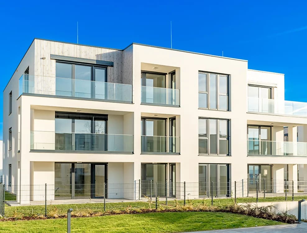
- Residential complex / apartment block: Main color in light gray or off-white; medium gray or beige on balconies, corners and string courses; a modern look with anthracite details.
- Commercial building: Clearer contrasts: A light gray body, anthracite frame bands and stone or granite-textured surfaces on the ground floor.
Exterior pattern and texture options: From flat paint to stone-effect coating
When we say “pattern”, sometimes people think only of color blocks; however, texture choice is at least as important as color. At Silkcoat, you can roughly think of exteriors in three main groups:
Flat, matt exterior paints
Flat paints provide a homogeneous appearance without creating grain or relief on the surface. They are preferred especially on modern, simple façades.
- Silicone: Silicone-based exterior paint; creates a matt, regular surface. Commonly used with neutral and pastel tones.
- Acrylic: Acrylic-based exterior paint; a balanced, practical solution in terms of color and texture.
- Hydroclean and Hydroclean Plus: Series designed for exteriors with a flat appearance; create a simple mattness and integrity on the façade.
- Elasticoat and Elasticoat Silikonlu: With their elastic structure, they adapt to surface movement and offer results close to a flat appearance with a slightly textured look.
Textured coatings: Acrycoat, Silkoterasit, Ruloser
Textured coatings create a pronounced texture on the surface, providing both mechanical strength and aesthetic “relief”. They are preferred especially on ground floors, corner columns, parapet walls and impact-prone areas.
- Acrycoat: Acrylic-based textured coating; gives a homogeneous, stone-like textured surface.
- Silkoterasit and Silkoterasit Silikonlu: Mineral, stone-like textured appearance; compatible with classical and semi-classical façades.
- Ruloser and Ruloser Silikonlu: When applied with a roller, they create a directional pattern; they have the advantage of hiding application lines and creating a lively surface.
Stone and granite–marble effect decorative coating: Stone
Stone is a decorative coating that gives the feeling of stone or granite–marble. It is frequently preferred on ground floors and entrance axes of hotels, villas and commercial buildings.
- With its natural stone appearance, it allows you to highlight the main body with paint and the ground floor and entrances with stone texture.
- When protected with Stone Guard, the color depth and decorative effect of the surface are preserved for a long time.
Patterned elastic coating: Elasticoat Desenli
Elasticoat Desenli combines an elastic structure with a patterned appearance. You can create linear or slightly raised effects on the surface using a roller, trowel or different tools.
The most common usage methods in practice:
- Creating subtle shadow plays by using flat Elasticoat on the main body and Elasticoat Desenli on projections and corners.
- Adding volume within a single color on intermediate bands and vertical structures in modern residential complexes with patterned application.
Color & pattern combinations by architectural style and building type
The same color and product can yield completely different results in different architectural styles. The combinations below are scenarios that are frequently applied on site and give balanced results.
Classical façades (with moldings and cornices)
- Main body: Light cream or off-white flat paint (Silicone or Acrylic).
- Moldings and cornices: Beige or stone tone one shade darker; for a richer texture, Silkoterasit Silikonlu.
- Ground floor: If exposed to impact and prone to dirt, use medium-dark earth tone Acrycoat or Stone.
Modern / horizontal façades
- Main body: Light or medium gray flat paint (Hydroclean, Hydroclean Plus or Silicone).
- Balcony lines and vertical bands: Anthracite or dark gray; for a stronger texture, Ruloser Silikonlu.
- Ground floor: To reinforce the concrete feel, stone tones in Stone or textured Acrycoat.
Detached house & villa combinations
- Scenario 1 (Natural and warm): Light beige Silicone on the main façade, stone-toned Stone on the ground floor, one tone darker cream flat paint around the windows.
- Scenario 2 (Modern and calm): Light gray Hydroclean Plus on the main façade, dark gray Elasticoat Desenli on corner columns and the entrance axis, Acrycoat on garden walls.
Apartment block / residential complex combinations
- Body: Light off-white or light gray flat paint (Acrylic / Silicone).
- String courses and balcony undersides: Medium gray; Ruloser to enliven the surface.
- Ground floor and around parking areas: Darker textured coating for resistance to dirt and impact (Acrycoat or Silkoterasit).
Ground floor, balcony undersides, columns and moldings
It is possible to continue in these areas with a single type of flat paint; however, the following approach is commonly preferred in practice:
- Using a darker and textured coating on the ground floor and corner columns (e.g. Acrycoat, Silkoterasit Silikonlu, Stone).
- Lightening the façade with a lighter and flat paint on upper floors.
- Framing the façade without overwhelming it by keeping moldings and frames half to one tone darker or lighter than the main body.
Climate, surroundings and ease of maintenance: Practical criteria for choosing color and pattern
Making a decision on color and pattern based solely on appearance can lead to regret later on, especially on exteriors. Climate, orientation and environmental conditions must definitely be taken into account.
Light–dark balance and climate
- In hot climates: On sun-exposed façades, light tones (white, cream, light gray) retain less surface heat. Avoiding dark colors on south and west façades reduces the heat load.
- In cold and cloudy climates: Medium and warm tones (beige, earth, warm gray) make the building look more inviting. An entirely dark façade may absorb too much ambient light.
- North façades: Since they remain in shade throughout the day, very dark tones can make the façade overly gloomy. One or two shades lighter of the same color generally gives a more balanced result.
Dirt, fading and the relationship with texture
- Heavy-traffic or industrial areas: Since soot and dust are intense, off-white, cream or sand tones may be more balanced instead of pure white. Although textured coatings hold dirt, they can mask stains better within the pattern.
- Coastal and humid regions: Salty air and humidity can leave marks on the surface. In these regions, choosing both color and product from series developed for exterior performance (e.g. Hydroclean, Hydroclean Plus, silicone-based products) is important for long service life.
- Dark colors: On sun-facing façades, fading becomes more visible and dirt is more noticeable. Using dark tones in selected areas instead of the entire façade is a practical solution.
The right system: Compatibility of primer, coating and topcoat
For the color and pattern you choose to stay the same for a long time, you must consider the entire system, not just the topcoat paint:
- Clean the surface and repair any unsound areas.
- Select a suitable primer for the substrate (for example, Silikon Astar for silicone-based systems, Akrilik Astar for acrylic-based systems).
- Apply waterproofing or base coat as needed (for example, protecting the base layer against water with solutions such as Subend).
- Apply the selected coating or patterned product (e.g. Acrycoat, Silkoterasit, Stone, Elasticoat Desenli).
- If necessary, especially on stone-textured and mineral surfaces, use a protective coat (e.g. Stone Guard or protective varnishes such as SX 2005 on mineral textures).
- Clarify the color by applying your final flat or lightly textured paint (e.g. Silicone, Acrylic, Hydroclean, Elasticoat series).
Working with a color chart and decision process: Step-by-step guide
There can be significant differences between the color you see on a computer screen and the color you see on the real façade. For the right decision, proceeding with a color chart and small test areas is the most reliable way.
Step-by-step selection method
- First clarify the building type and style: Classical, modern or mixed? This makes it easier to narrow down the color group.
- Using our Color Charts, determine 3–4 main color families (for example: off-whites, stone tones, light grays, dark accent colors).
- Select no more than two or three candidate tones from each family; thus you create a narrow selection range of 6–8 colors in total.
- Apply the tones you have chosen on small surfaces (for example on 50x50 cm panels or on an inconspicuous area of the façade).
- Examine these test areas at different times of day:
- In the morning sun, in direct midday light, in the afternoon shade.
- Observe the difference between rainy/overcast and sunny days.
- Check compatibility with surrounding buildings: A color that stands out too much and “shouts” may become disturbing after a few years.
- Check interior–exterior harmony: Make sure there is basic harmony between exterior tones and the colors of main interior spaces such as the living room; avoid creating completely different worlds.
Common mistakes
- Painting the entire façade in a dark color at once and having to live with a heavy result for years.
- Deciding solely based on the color code without considering pattern and texture at all.
- Ignoring the fact that skipping primer seriously affects the uniformity and durability of the topcoat color.
Sample exterior combinations with Silkcoat and your next step
The following combinations are sample schemes to help you balance color and pattern. You can think in terms of tone descriptions rather than color names; you can select the exact tone from our Color Charts.
Sample combination 1 – Natural villas
- Main façade: Silicone in a light stone tone.
- Ground floor and entrance axis: Stone in a stone color one or two tones darker, then protected with Stone Guard.
- Moldings and frames: Half a tone lighter cream than the main body, with flat Acrylic.
Sample combination 2 – Modern apartment / residential complex
- Body: Light gray Hydroclean Plus.
- Balcony undersides and vertical bands: Medium gray Ruloser Silikonlu with directional texture.
- Ground floor: Acrycoat or Silkoterasit in a dark tone close to anthracite.
Sample combination 3 – Commercial building / office
- Body: Off-white Hydroclean or Silicone.
- Corner columns and frame bands: Dark gray Elasticoat Desenli with a slightly raised pattern.
- Entrance area and sides of display windows: Stone-toned Stone, protected with Stone Guard in heavily used areas.
The most concrete steps you can take from here:
- Select the scenario in this article that is closest to you, taking into account your building’s architectural style and surroundings.
- Determine a neutral main tone, one or two accent colors and one texture (textured or stone-effect).
- To narrow down your options, choose 6–8 tones from the Silkcoat color chart and apply small test areas.
- Review the product series that suit your needs (flat, elastic, textured, stone-effect) and plan color and pattern together.
In this way, you can achieve an exterior color and pattern combination that you will be satisfied with for many years, not just because it is “trendy”, but in harmony with your building’s location, climate and usage.
You should choose according to architectural style, climate, façade orientation, surrounding buildings and maintenance frequency. The lightness-darkness and warm-cool balance of the color also directly affect how the building is perceived.
White, off-white, cream, light gray and nature tones such as stone and sand are the most commonly used colors. Dark tones are generally preferred for specific accents and highlights.
Pattern and texture create light–shadow play on the surface, making the façade look more lively or more simple. They also affect how much dirt is visible, impact resistance and maintenance needs.
Flat paints offer a simpler and calmer appearance, while textured coatings are more tolerant to impacts and can be more advantageous on ground floors and corners. It is best to decide according to how the building is used.
First determine the main color, then choose lighter-darker complementary tones and patterned-textured surfaces in limited areas. Working with a color chart, sample applications and example combinations reduces the risk of mistakes.
Dark colors create a dominant effect when used on the entire façade, so they generally give more balanced results when used for emphasis on architectural details such as window surrounds, projections, columns and eaves.
The duration depends on the size of the surface, the type of material chosen and weather conditions. Since primer is applied first and then flat paint or textured coating, you must take drying times into account when planning.
Patterned and textured coatings are frequently applied on concrete, plaster and suitably prepared previously painted surfaces. They provide both protection and aesthetic advantages especially on ground floors, entrances, corners and impact-prone façades.