

Silk plaster designs: Which pattern suits which room?
Choose the right pattern, texture and glitter density for your space with silk plaster designs. Discover the most popular looks for living rooms, bedrooms and TV walls.
What does “design” mean in silk plaster? Relationship between pattern, texture and glitter
When looking at silk plaster designs, most people don’t fully know what they’re actually deciding on: the color, the texture, the glitter density, or the application pattern? This uncertainty can lead to results like “it looked nice in the photo, but too heavy on the wall.”
When we say “design” in silk plaster, we actually need to consider several elements together:
- Color: Light–dark shades, warm–cool color balance, combination of multiple colors.
- Texture: The feel of the surface by hand and eye; flatter, slightly wavy, distinctly embossed, etc.
- Glitter / sparkle density: Scale from no glitter – light – medium – intense sparkle.
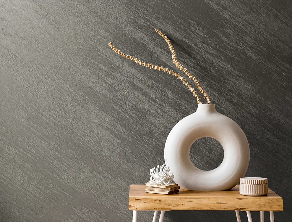
- Pattern direction: Vertical, horizontal, diagonal, circular or mixed directions created by trowel movements.
While classic flat wall paint usually offers a single color and smooth surface, with silk plaster it’s possible to obtain completely different designs even in the same color. The applicator’s trowel movement, pressure and the amount of glitter added completely change the character of the wall.
Highlights
- In silk plaster, “design” is the combination of color + texture + glitter density + application pattern.
- The most popular designs are plain-simple, lightly glittered, and strongly textured looks on TV units/headboard walls.
- The light and size of the space significantly change how the same design will look on the wall.
- There are different priorities for design selection in living rooms, bedrooms, children’s rooms and similar areas.
- When deciding, always test on a sample surface and check under different lighting conditions.
The most popular silk plaster pattern types
When you look at silk plaster catalogues there are many names, but the main design types we see on the wall are generally divided into similar categories. We can summarise the pattern types most commonly chosen in practice, along with their pros and points to consider.
Flat and simple textures
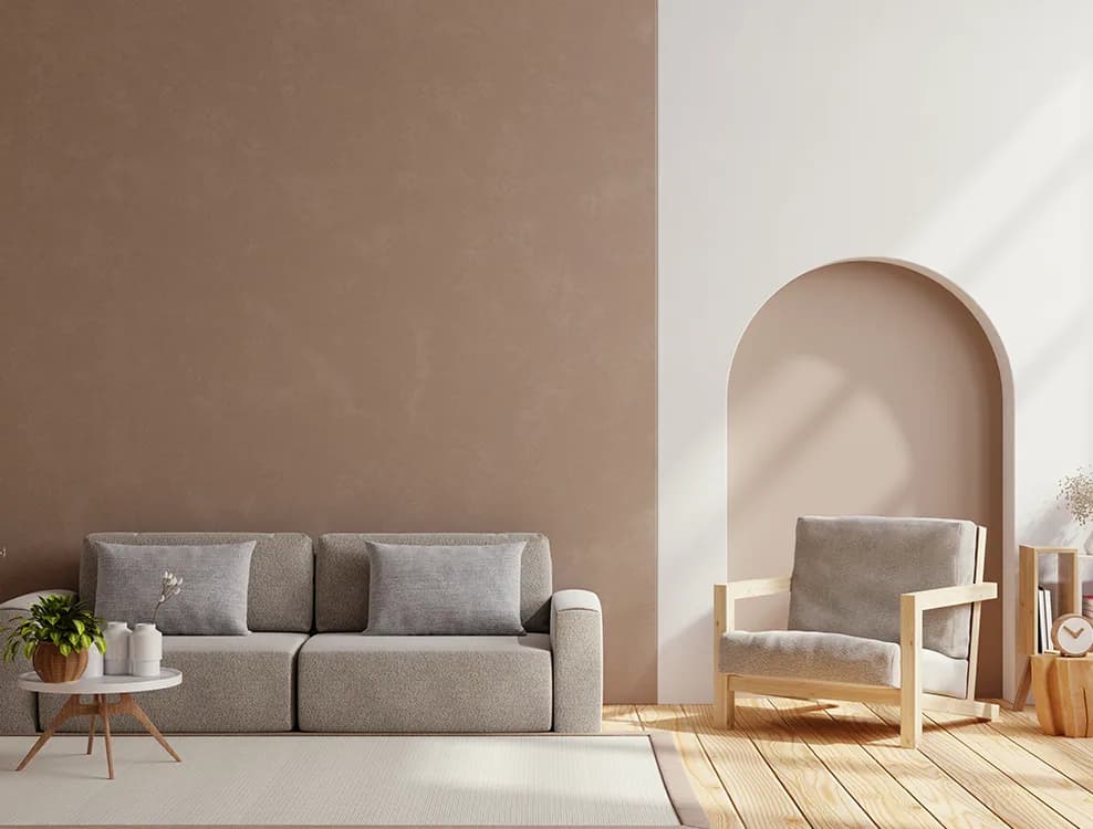
Who are they for? Users who like minimalist decoration and want a calm backdrop rather than movement on the wall.
Features:
- Slightly wavy but overall a calm surface.
- No glitter at all or used in a very limited amount.
- Typically light and neutral tones are preferred (such as cream, beige, light grey, off-white).
Advantages: Does not strain the eyes, doesn’t clash with furniture and textiles, and offers a relaxing atmosphere in calm areas such as bedrooms and studies.
Lightly glittered / sparkling surfaces
Who are they for? Especially users who want to reflect light and add vibrancy to the space in living rooms and entrance halls.
Features:
- Light glitter or sparkle particles on a light-toned base.
- Creates a sense of movement on the surface in daylight and under spot lighting.
- When glitter density is kept under control, it provides both an elegant and timeless appearance.
Note: As glitter density increases, the surface may look more “playful” and tiring, especially in small and dark rooms. For this reason, it is more balanced to use it on selected surfaces rather than on all walls.
Intensely patterned and dynamic looks
Who are they for? Users who want to highlight a specific wall such as the back of the TV unit, headboard wall or dining area.
Features:
- Strong textural effect created by circular, wavy or mixed trowel movements.
- A very striking look when combined with medium or intense glitter.
- When used on a single wall, it clearly defines the focal point of the space.
Common application mistakes: Using the same intense pattern on all four walls of the room can make the space visually tiring and look smaller than it is.
Accent on a single wall, simple design on the other walls
One of the most balanced solutions in practice is to choose a feature wall and keep the other surfaces with a simpler silk plaster design.
- Living room: Strongly patterned behind the TV unit, flat or lightly glittered on the other walls.
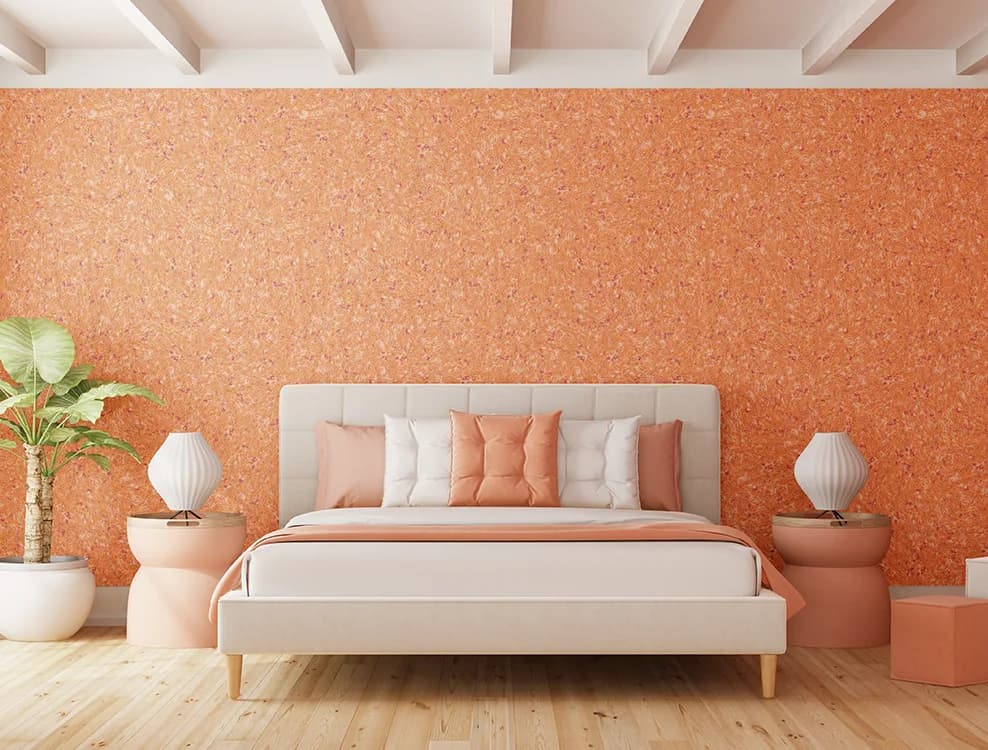
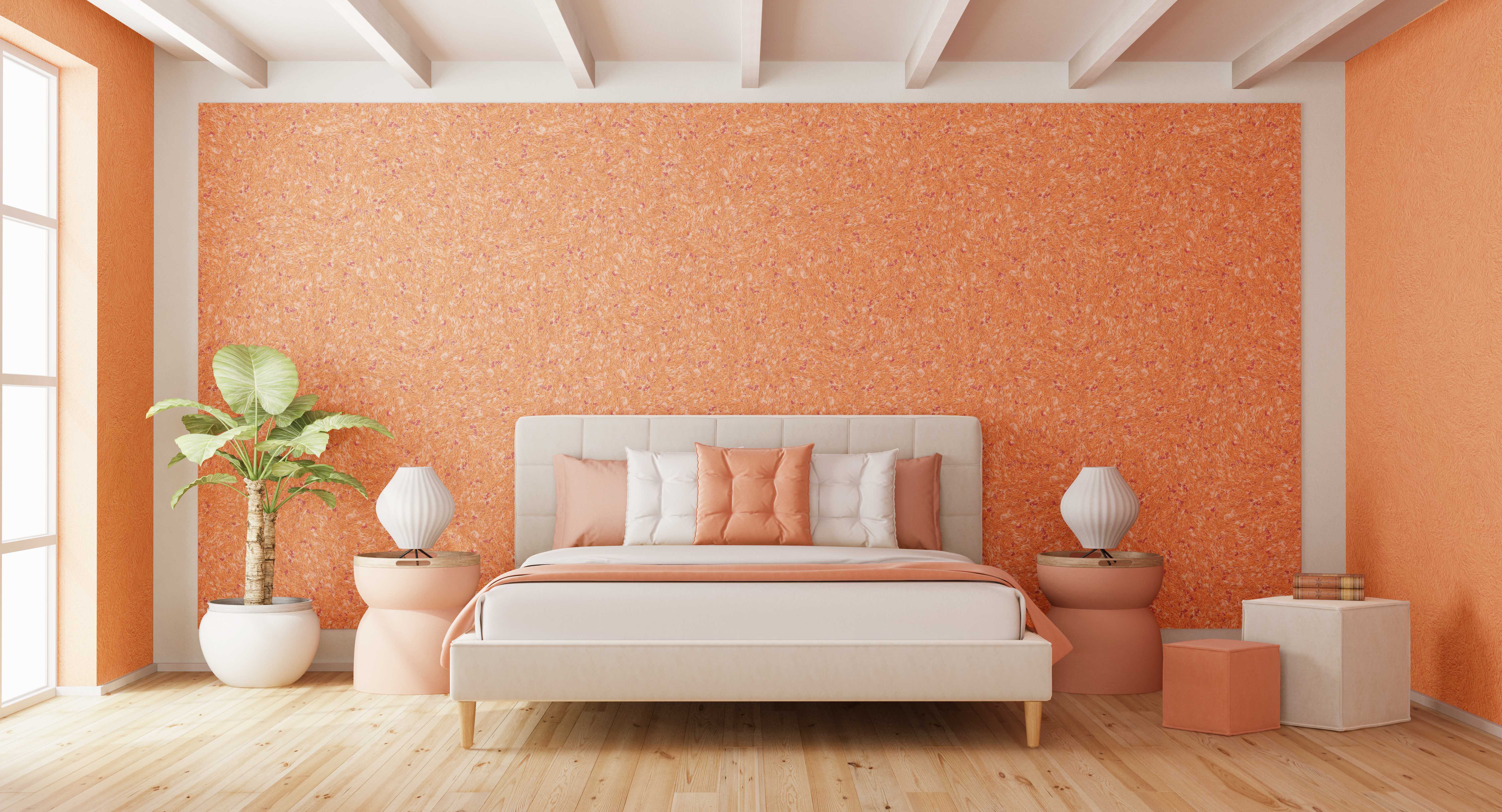
- Bedroom: Distinct texture on the headboard wall, softer design on the other three walls.
- Children’s room: More dynamic on the play area wall, simple on the study/sleeping area walls.
This approach allows you to benefit from the decorative power of silk plaster while maintaining calmness throughout the space.
Choosing a silk plaster design by room
The same silk plaster design may look stylish in the living room but heavy in the children’s room, or too dynamic in the bedroom. Therefore, design selection must always be considered together with the function of the space.
The most popular designs for living rooms
The living room is a space that receives natural light during the day and is used with artificial lighting in the evening. Therefore, when choosing a design, a surface that is light-friendly, easy on the eyes yet characterful is targeted.
- In large living rooms:
- Light–medium glitter, distinct but not exaggerated patterns on the TV wall or dining area wall.
- Flat or very lightly textured designs on the other walls.
- In small living rooms:
- Using light colors + lightly glittered designs to make the space feel airy.
- Using intense patterns only on a single small wall.
Bedroom: Balancing calmness and warmth
The most common goal in the bedroom is a look that is calm but not ordinary. Therefore:
- On the headboard wall:
- Soft-textured, subtly defined patterns.
- If glitter is desired, use it at a very light level and choose designs that look balanced especially with warm white light.
- On the other walls:
- Opt for flatter and non-glittered designs so that the headboard wall stands out slightly.
Cool colors (greys, blues) can be calming, but if chosen too dark they can make the room look smaller than it is. Warm off-whites, beige and powder tones are preferred especially in bedrooms that receive little daylight.
Children’s room: Fun but balanced designs
One of the most important expectations in children’s rooms is a fun look + easy cleaning. The following approach works when choosing a design:
- On the play or sharing wall:
- More dynamic, lightly patterned surfaces (they show stains relatively less).
- Avoid very intense glitter; opt for soft-transition designs that don’t tire the eyes.
- In the study desk and bed area:
- Simpler and lighter-toned designs support concentration.
The most common mistake in practice is covering all four walls of the room with very dynamic patterns and, together with toys and textiles, creating an overly complex visual environment.
Entrance and corridor: Textures that don’t narrow the space
Entrances and corridors are usually narrow areas with limited daylight. Therefore:
- A combination of light tones + light glitter makes the space look brighter.
- In long and narrow corridors, vertical trowel movements can emphasise the ceiling height.
- Avoiding overly embossed textures helps make scuff marks from brushing against the wall less noticeable in passage areas.
Relationship between light, color and pattern: How does the same design look different in another room?
When choosing silk plaster, you may notice that a design you liked in the catalogue looks darker, shinier or more dynamic in your own home. The main reason for this is the interaction between light + color + texture.
Rooms that receive daylight and those that don’t
- Rooms with plenty of daylight:
- Light and medium-density glittered designs provide sparkle from different angles throughout the day.
- Even very dark tones are perceived more softly; still, keeping the single feature wall approach is a good idea.
- Rooms with limited daylight:
- When dark color + intense glitter + distinct pattern are combined, walls may look “dense” and dominant.
- Lighter tones and light glitter look comfortable under artificial lighting.
Spot lighting and wall-washer lights
Silk plaster shows its texture very strongly especially under wall-washer type lights (lights placed close to the wall, grazing the surface).
- Intensely textured and glittered designs:
- Give a highly dramatic effect when used together with spot or wall-washer lighting.
- This combination is usually seen behind TV units, on fireplace walls or in hotel lobbies.
- Flatter designs:
- Create a calmer backdrop under general lighting.
The importance of testing the design on a small area
Looking only at the catalogue image is often not enough to understand in advance how silk plaster will look on the wall. The steps below help you make a more accurate decision:
- Choose 1–2 colors and texture types you like.
- Ask your applicator for a small sample surface or a test area on a less visible part of the wall.
- Throughout the day, look at this surface:
- In the morning, at noon and in the evening;
- Under different scenarios such as normal lighting, spot-only, daylight-only.
- Note any points that feel too dynamic or dark to your eye; if necessary, move to a lighter shade or a simpler pattern.
Design and texture options in Silkcoat silk plaster ranges
In the Silkcoat silk plaster world there are several core ranges that appeal to different decoration styles. Thinking of these ranges in terms of “which design type they are more suited for” makes the decision process easier.
Silk Plasters (Silk Plaster Ranges – Elegant)
General character: Classic, elegant silk plaster surfaces with a wide range of applications.
- Often preferred for plain, lightly textured and everyday-use-friendly designs.
- In interior residential spaces such as living rooms, bedrooms and children’s rooms, it is a strong starting point for core design selection.
- Easily matches with minimalist or classic decoration.
Prestige (New 100 Series)
General character: A more select range for projects that require accentuated and prestigious surfaces.
- Suitable for feature walls such as TV walls, hotel lobbies and prestigious office entrances.
- Adds character to the space with more pronounced patterns and attention-grabbing textures.
- In the same project, using Prestige only on selected walls together with the Elegant range offers a balanced solution.
Smart Colours: Flexibility in coloring the silk plaster design
General character: A range that keeps the silk plaster texture fixed while providing freedom in terms of color.
- Can be used to create more original color combinations that match your existing decoration palette.
- For example, in children’s rooms or branded commercial spaces it is possible to obtain tones close to corporate colors.
- In architectural projects, it is preferred to get closer to RAL or special color ranges along with the property owner’s preferences.
Adding extra sparkle with Silver and Gold Glitter
Adding Silver and Gold Glitter to an existing silk plaster design is like adding a second design layer to the surface.
- Silver glitter:
- Gives a modern and elegant look with cool greys, blues and anthracite tones.
- Gold glitter:
- Creates a more luxurious and warm feel with beige, cream, earth tones and warm greys.
In practice, it is common to use extra glitter on just a single wall in the living room or entrance, leaving the other walls simpler.
Design selection in terms of application and maintenance
When choosing a design, you need to consider not only the appearance but also ease of application, cleaning and the possibility of future repairs. This section can serve as a practical checklist especially for architects and applicators.
Flatter surface or dynamic texture?
| Design Type | Cleaning | Touch-up / Repair | Workmanship Expectation |
|---|---|---|---|
| Flatter and simpler textures | Stains may be seen more clearly, but the direction of wiping matters less. | The tone of the touch-up spot must be matched well; if done properly it blends homogeneously into the surface. | More manageable for beginner applicators. |
| Intensely patterned / dynamic textures | Generally camouflages minor stains and touch marks better. | The texture and trowel movement must be replicated; requires an experienced applicator. | The quality of workmanship is directly visible; continuity of the pattern must be ensured. |
Practical tips for the applicator
- On walls where a very intense pattern is planned:
- First create a pattern demo on a small panel for “customer approval”.
- Plan a continuous working process without dividing the wall into sections; otherwise, joints may become visible.
- In glittered applications:
- Stir the mixture regularly throughout application to keep glitter distribution homogeneous.
- On sunlit walls, check frequently from different angles during application.
Tips for choosing a timeless design
Since silk plaster is a coating that can stay on the wall for many years, designs that “won’t go out of fashion quickly” always have an advantage:
- Avoid very intense patterns and glitter on all walls.
- Choose neutral and simple designs on main walls, and characterful but not exaggerated textures on feature walls.
- If furniture and carpet patterns are very busy, keep wall designs simple.
Decision guide for property owner, architect and applicator
In most projects, the choice of silk plaster design is finalised jointly by the property owner, architect and applicator. The following steps can help manage this process more effectively.
1. Start with room photos and a color chart
- Collect up-to-date photos of the rooms to be coated.
- Note the colors of furniture, flooring, doors and textiles.
- Review these visuals side by side with the silk plaster color chart and product brochures.
This way you evaluate the designs you like not only on their own but also together with the other materials in the space.
2. Balancing multiple designs in the same project
A frequently used approach in projects is:
- Core areas (most of the room walls):
- Simpler, lightly textured designs from the Silk Plasters (Elegant) range.
- Feature walls:
- More distinct texture and color with Prestige, supported by Silver or Gold Glitter where needed.
- Special color demands:
- Working with Smart Colours on project-specific tones.
3. Effect on design when switching from painted wall to silk plaster
Some technical points matter when choosing a design for silk plaster application on an existing painted wall:
- Surface evenness:
- Very prominent waves and defects become more visible especially with flat and simple designs.
- On such surfaces, either surface levelling should be done or lightly textured designs should be chosen.
- Color transition:
- When moving from a very dark painted wall to a light-colored silk plaster, priming and preparation must be done properly; otherwise, underlying color transitions may be noticeable.
4. Seeing how the design you like will look on the wall
Before deciding on a design, you can get a clearer idea with the following method:
- Select the 2–3 designs and colors you like most.
- Ask your applicator to prepare a small test panel or create a 1–2 m² test area on a short wall of the room.
- Observe these panels:
- In different spaces such as living room, bedroom and children’s room,
- During the day and under evening lighting.
- With your family or project team, choose the design that looks the most balanced.
5. Also considering decorative alternatives
While deciding among silk plaster designs, you can also consider interior decorative coatings such as Silkofarit as an option for different textures. This way it is possible to create a richer texture palette by using silk plaster on some of the walls and different decorative coatings on others in the project.
Conclusion: What should be your next step when choosing a silk plaster design?
When choosing between silk plaster designs, it’s important not to decide only based on the feeling of “it looks good in the photo”, but to consider the function of the space, its light, existing decoration and maintenance expectations together.
Here are some concrete steps you can take from this point on:
- Decide separately on the design type (simple, lightly glittered, intensely patterned) for the living room, bedroom, children’s room and entrance.
- Identify the options in Silkcoat silk plaster ranges (Elegant, Prestige, Smart Colours) that best fit these styles.
- For the 2–3 designs you like most, always have a sample surface or small test area prepared.
- Observe these samples under different lighting conditions and make the final decision together with the whole family or project team.
In this way, you can confidently choose a silk plaster design that not only follows trends but that you will enjoy for years, and that suits your space and usage habits.
A silk plaster design is the combination of color, texture, glitter density and application pattern. Even the same color can take on a completely different look with different textures and trowel movements.
In living rooms and entrances, lightly glittered, dynamic surfaces are preferred; in bedrooms and children’s rooms, simpler, eye-friendly textures are better. More intensely patterned designs stand out behind TV units and at the headboard wall.
The size of the room, amount of daylight, and existing furniture and textile colors must be taken into account. Since the same design can look very different under different lighting, it is recommended to test it on a sample surface.
The duration varies depending on the surface area, intensity of the chosen texture and the applicator’s experience. Flat and simple textures are usually faster to complete, while very dynamic and embossed patterns take longer.
Silk plaster can be used on clean, dry, sound and properly primed interior surfaces. Old, flaking paint and damp substrates must first be repaired and then prepared according to the product’s technical specifications.
In small and low-light rooms, light tones, simple textures and controlled, lightly glittered surfaces look more balanced. Very dark colors and intense patterns can make the space feel narrower than it is.
Glittered designs are preferred especially in living rooms and entrances because they reflect light and add vibrancy and depth. However, when glitter density is very high, simpler options should be chosen for small and dark rooms, as the surface may look tiring.