
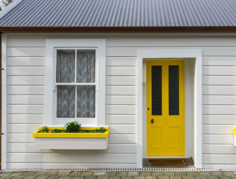

Sand Beige Paint Color for Modern and Airy Interiors
Why does sand beige paint not suit every space? A practical guide to undertone, light and sheen, the right pairings and product choice, step by step.

Sand beige is one of the most widely chosen wall colors of recent years: neutral enough to let the furniture take the lead, warm enough not to look as sterile as white. But "sand beige" is not a single color, it is a broad family. Two shades that carry the same name give completely different results in the same room, because one leans yellow and the other leans pink. In this article we explain how to choose the right sand beige shade, how it behaves under which light and which product to apply it with.
Key Takeaways
- Sand beige is not a color but a family; what decides the outcome is the undertone (yellow, pink or gray).
- In rooms that receive little light a yellow-undertone sand beige looks more balanced, in rooms that receive plenty of light a gray-undertone one does.
- The harmony it builds with natural materials such as wooden flooring, travertine and linen is this color’s real strength.
- Matt products soften sand beige, satin products make it look more saturated and lively.
- Instead of leaving the wall in a single flat color, using a textured coating on one surface keeps a beige space from falling flat.
What Is Sand Beige and Why Is It So Widely Chosen?
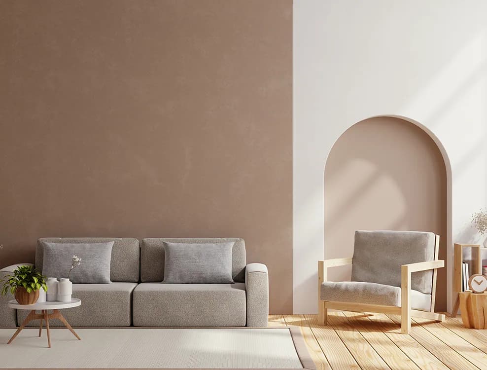
Sand beige is a warm neutral shade that takes its name from the color of sand: a little more saturated than white, much lighter than brown. The reason for its popularity is that it can work as a "background" in decoration. A white wall can feel clinical, especially in rooms that receive cold light; dark colors, on the other hand, make the space feel narrower and look out of place once you change the furniture. Sand beige sits between the two: it keeps the room airy but does not give a feeling of emptiness.
Another reason is durability — to the eye. Very light cool shades show scuff marks more clearly in hallways and living rooms, while very dark shades show dust and fingerprints more clearly. Mid-light warm neutral shades are the group that reveals everyday marks the least; this also reduces how often you have to wipe them.
Learn to Read the Undertone
The real difference between sand beige shades lies in the undertone, and that difference only becomes visible side by side. When you place a sheet of white paper next to the shade:
- Yellow-undertone sand beige looks warmer and more "beach-like". It restores the balance in north-facing rooms that receive cold light; in south-facing rooms it can look too yellow.
- Pink/peach-undertone sand beige is skin-friendly and soft. It gives good results in bedrooms and children’s rooms; in spaces such as offices it can look too romantic.
- Gray-undertone (greige) sand beige is the most modern looking of them all. It suits large, well-lit living rooms and furniture with gray and black details; in rooms with little light it can turn dull.
It is hard to judge an undertone from a color card on its own. Placing the two or three codes you have picked on the interior color card side by side and seeing the difference between them is far more informative than staring at a single swatch for a long time.
Light and Orientation: Same Code, Different Room
| Room condition | Recommended undertone | Why |
|---|---|---|
| North-facing, little light | Yellow-undertone sand beige | Balances the cold light, the room does not stay dull |
| South-facing, plenty of light | Gray undertone (greige) | The yellowness is not exaggerated in strong light |
| West-facing living room | Neutral or slightly gray | The shade does not shift in the orange evening light |
| Room used under artificial light | According to the bulb temperature | Warm white bulbs bring out the yellow, cool white bulbs the gray |
Before you make the decision, apply the shade you have chosen to the wall in two coats, wait 24 hours and look at it separately in the morning, in the afternoon and in the evening. With low-saturation colors such as sand beige, the effect of light is far more decisive than it is with vivid colors.
What Is It Paired With?
The real strength of sand beige is the relationship it builds with natural materials:
- Wood: It forms a natural harmony with oak and walnut tones. On very yellow wooden floors, a gray-undertone beige restores the balance.
- Stone and travertine: The porous texture of natural stone creates a strong contrast against a plain beige wall.
- Textiles: Matt textures such as linen, cotton and wool soften sand beige; glossy satin fabrics make it look more formal.
- Metal details: Matt brass and bronze increase the warmth; matt black and anthracite bring the modern side forward.
- Green: Olive and sage greens are the safest accent pairing with sand beige.
Keeping the ceiling and the trim one shade lighter than the wall makes the room look taller and tidier. Painting every surface in the same beige shade, on the other hand, flattens the space.
Which Product Is It Applied With?
The character of the surface determines the result as much as the color does. In the Silkcoat interior range there are three common approaches for sand beige shades:
- Satin finish: Natural is a silk-matt looking topcoat based on an acrylic copolymer binder; it makes the color look more saturated and its washability is high. It is preferred in hallways, entrances and kitchens.
- Silk matt finish: Silkosil is a silicone-modified silk matt product; in living rooms and hallways it softens the color while still allowing cleaning.
- Matt finish: Silkomatt gives a matt surface, diffuses the light and hides small imperfections on the wall. In calm spaces such as bedrooms it shows sand beige in its softest form.
In spaces that stay closed for long periods, such as children’s rooms and bedrooms, Astımat, which contains very low VOC, is a separate option. For the sheen level and consumption values of the products, see their TDS.
Keeping a Beige Space from Falling Flat
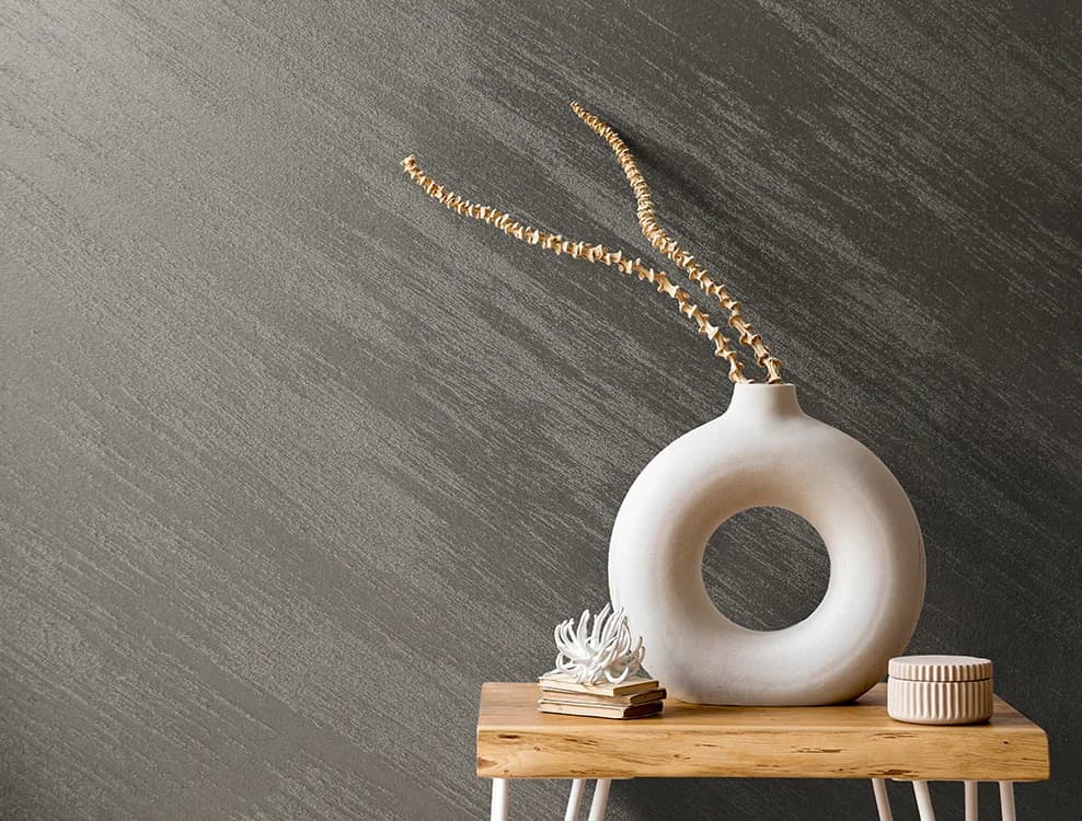
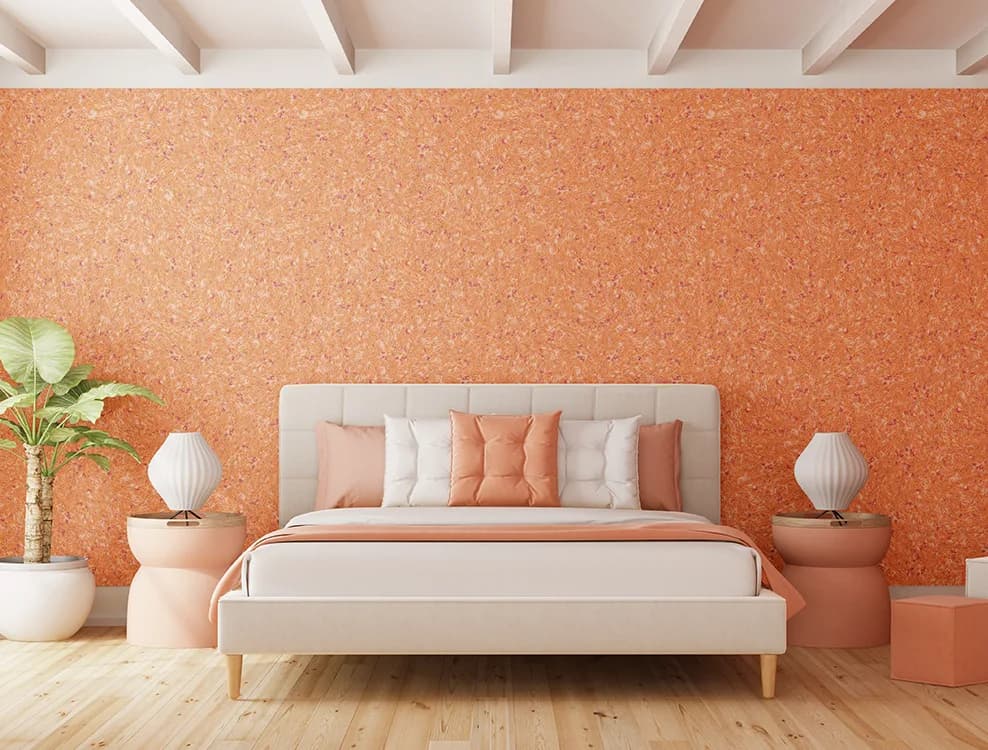
The only risk with sand beige is that it makes the space monotonous when it is used in the same shade on every surface. The solution is not to change the color but to add texture. When the television wall in the living room, the headboard wall in the bedroom or the single surface at the end of the hallway is given over to a textured coating, the remaining beige walls become even stronger as a background.
There are two directions most often used for this: silk plasters give a soft, fabric-like texture and reduce sound reflection; effect products with an aged stone look such as Travertino carry the character of natural stone onto the wall. On the bedrooms page we covered calm textures and the balance of color temperature with examples.
Common Mistakes
- Choosing it simply as "beige" without looking at the undertone and clashing with the wood in the room.
- Using a gray-undertone beige in a room that receives little light and making the space dull.
- Painting the wall, the ceiling and the trim in exactly the same shade.
- Making the test in a single coat and on an area the size of your palm; low-saturation colors such as sand beige look almost white on a small area.
- Choosing a very cold blue as the accent color and letting it clash with the warm beige.
Maintenance and Touch-Ups: Keeping a Beige Wall the Same for Years
The greatest test for light shades such as sand beige is not the first year but the third. Over time the wall changes very slowly under the effect of dust, friction and sunlight; this change is not noticeable to the eye, but a touch-up applied on top of it looks like a patch. So if you are considering touch-ups, plan two things from the outset.
First, keep some product from the batch you painted with in a tightly closed container and write the room name, the product name, the color code and the date on it. Second, apply the touch-up not to a single mark but to a section of the wall running from corner to corner; the transition between paint surfaces disappears at a corner, it does not disappear in the middle of the wall.
In everyday maintenance a soft cloth and warm water remove most marks. The problem encountered most often with sand beige shades is the gray scuff marks along contact lines such as hallways and staircases. In those areas, choosing a silk matt or satin product instead of a matt one noticeably reduces how often you have to wipe and how much touching up you need.
Conclusion: The Right Undertone, the Right Finish
Chosen with the right undertone, sand beige is a background you will not want to change for years. Read the orientation and the light of the room, verify the undertone by comparing it with a sheet of white paper, set the sheen level according to how heavily the space is used, and give the space depth by adding texture to a single surface.
A concrete next step: pick three sand beige codes from our color cards, test each of them in two coats on a primed surface and make the decision at three different times of the day. If you are planning a textured feature wall, start by looking at the examples on the living rooms page.
It is suitable for the living room, the bedroom, the hallway and the study. In rooms that receive little light a yellow-undertone sand beige looks more balanced, in large spaces that receive plenty of light a gray-undertone (greige) one does.
Oak and walnut wood, natural stone, and linen and cotton textiles are the safest pairings. As accent colors, olive and sage greens and matt brass and bronze details give good results. Very cold blues can clash with warm beige.
Place a sheet of white paper next to the shade. If it leans yellow in the comparison it is a warm beige, if it leans pink a soft one, if it leans gray a modern one. Looked at on its own, these differences are not visible.
In calm spaces such as bedrooms, matt softens the color and hides wall imperfections. In areas that are wiped often, such as hallways, entrances and kitchens, satin or silk matt surfaces both make the color look more saturated and make cleaning easier.
Yes. Light sand beige shades keep the space as airy as white but give a warmer feeling. Leaving the ceiling one shade lighter than the wall makes the height more noticeable in small rooms.
They can if every surface is finished in the same shade and the same texture. Giving a single wall over to a textured coating such as silk plaster or Travertino strengthens the remaining beige surfaces as a background.
It should be applied in two coats on a primed surface. In a single-coat application the film thickness remains insufficient; the color looks uneven and washability drops. For the waiting time between coats, see the TDS of the product.
Yes, as long as you keep the color code. Note the code on the paint tin; with requests made only under the name "sand beige" it may not be possible to match exactly the same undertone.
Tags