



Choosing Effect Paint Colours: Light or Dark Tones?
Effect paint colour choice depends on the room's light, the effect's sheen and the chart. Light or dark tones? Answers with the Silkcoat colour charts.
Short answer: Effect paint colour choice depends on how much light the room gets, how glossy the effect is and how big the wall is. Light tones make small, dimly lit rooms feel airy, while dark tones bring out the depth of metallic and pearlescent effects. To decide well, look through the colour charts on silkcoat.com and try the colour on a small patch of the wall it is meant for.
What is effect paint colour choice?
Effect paint colour choice is the process of picking the shade of a decorative effect paint not only by taste, but by how the effect reflects light, which tones make the texture and pattern stand out, and the lighting conditions of the room. With a flat wall paint, the colour is a single surface colour; with effect paint, the same colour can look different through the day because of its pearl, metallic sheen or texture.
The Our Colour Charts page on silkcoat.com features 16 charts and 89 colours. The page notes that interior and exterior colour charts can be viewed on screen, while the texture charts for effect products can be viewed in high resolution and downloaded. Choosing an effect paint colour starts with these charts and ends with a test on the actual wall.
Light or dark tones: which should you choose, and when?
Light tones suit rooms you want to look spacious and bright; dark tones are best on a single feature wall where you want depth, warmth and emphasis, or in large, well-lit spaces. The table below compares the two options:
| Criterion | Light tone | Dark tone |
|---|---|---|
| Feel of the room | Airy, bright, spacious | Warm, deep, enclosed |
| Best suited to | Small rooms, dimly lit hallways | Large living rooms, feature walls |
| Effect on the finish | Texture and pattern look softer | Metallic and pearlescent sheen stands out more |
| Furniture match | Contrasts with dark furniture | Makes light furniture stand out |
| Watch out for | Very white tones can wash out the texture | Can make a small room feel smaller |
This table is a starting point, not a hard rule. The same colour can look cooler in a north-facing room and warmer in a sunny one. That is why effect paint colour choice should be made after watching how the light in the room changes during the day.
How does light change the colour of effect paint?
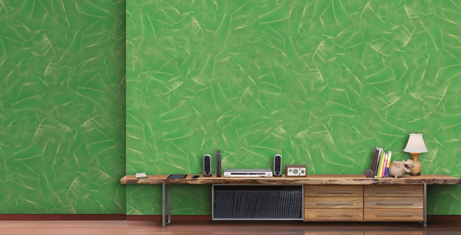
With effect paints, light is part of the colour: pearlescent, metallic and colour-shifting effects show different tones depending on the angle of the light. The chart descriptions on silkcoat.com explain this difference product by product:
| Product | silkcoat.com chart or product description | Impact on colour choice |
|---|---|---|
| Metalico | Effect paint with a metallic sheen; deep tones that change with the light | The sense of depth is stronger in dark tones |
| Magico | Dynamic effect paint that changes colour with the viewing angle | Judge the colour from several angles, not just one |
| Pearl | Effect coating with a pearlescent bead texture; surfaces that shimmer in the light | Soft shimmer in light tones, pronounced shimmer in dark tones |
| Marmarito | Fine-grained marble plaster texture; a wide range from vivid colours to pastels | How visible the marble veining is depends on the tone |
| Velvetto | A special pearl-like, semi-gloss and matt velvety look | The contrast between matt and glossy areas shifts with the tone |
We cover Magico's angle-dependent colour in our article on Magico colour-changing paint, and how pearlescent surfaces interact with light in what is pearlescent paint. Because light also reveals flaws in the substrate on glossy effects, checking for defects with raking light becomes even more important when you choose a dark, glossy tone.
What options do the Silkcoat colour charts offer?
The Our Colour Charts page on silkcoat.com has 16 charts and 89 colours; the standard chart for interior paints includes 42 colours ranging from off-whites to pastels. The charts on the page can be filtered into two groups, "Solid colour" and "Effect and texture":
- Interior chart: 42 colours ranging from off-whites to pastels.
- Exterior chart: 47 colours with earth tones, greys and natural greens.
- Effect and texture charts: Separate texture charts for effect products such as Marmarito, Metalico, Magico and Pearl.
- Silk plaster chart: A chart for the Silkcoat silk plaster range, offering warm surfaces with a natural fibre texture.
You can browse the charts on screen, but display settings can make colours look different from the real wall. So it is best to see the tone you picked on screen on a real sample before application; for samples and colour advice, get in touch with Silkcoat.
Can several colours be used together?
Yes, some Silkcoat effect paints allow several colours to be used together. According to the product pages on silkcoat.com:
- Arteco: Lets you work several colours on top of one another; creates antique, calm spaces.
- Magico: Allows different colour combinations at the same time.
- Metalico: According to the application instructions, the trowel can work over different colours.
With some products, the colour of the top coat is matched to the colour of the effect. The Velvetto page states that a single coat of Silkomatt in the Velvetto colour is applied as the top coat, and the Palace page likewise states that a single top coat of Silkomatt is applied in the same colour as Palace. When choosing a colour for these products, keep in mind that the top coat will be prepared in the same tone.
What steps should you follow when choosing a colour?
Effect paint colour choice comes down to observing the light in the room, choosing the effect, picking a tone on the chart and testing the colour on the actual wall. A practical order is:
- Observe the light: Note how the room is lit in the morning, at midday and in the evening, and what artificial lighting will be used.
- Choose the effect: Decide which effect suits the style of the room: metallic, pearlescent, marble, velvet or colour-shifting; you can compare products on the effect paints page.
- Pick a tone on the chart: Choose one light and one dark candidate tone from the texture chart of the relevant product on silkcoat.com.
- See a sample: Check what the on-screen colour really looks like on a sample.
- Test it on the wall: If possible, try it on a small patch and look at the colour at different times of day and from different angles.
- Factor in furniture and flooring: Check that the chosen tone works with the colours of your furniture, floor and textiles.
Conclusion
- Effect paint colour choice depends on the light in the room, the gloss of the effect and the size of the wall.
- Light tones bring a sense of space to small, dimly lit rooms; dark tones bring out the depth of metallic and pearlescent effects.
- The Our Colour Charts page on silkcoat.com has 16 charts and 89 colours, with separate texture charts for effect products.
- Always confirm a colour picked on screen with a sample or a test on the wall; for help choosing a colour, get in touch with us.
There is no single right answer. Light tones make small, dimly lit rooms look airy; dark tones deepen metallic and pearlescent effects and work well on feature walls.
The Our Colour Charts page on silkcoat.com features 16 charts and 89 colours. The interior chart has 42 colours and the exterior chart 47 colours; effect products have their own texture charts.
Yes. According to silkcoat.com, Metalico offers deep tones that change with the light, Magico changes colour with the viewing angle, and Pearl creates a surface that shimmers in the light.
Yes, with some products. According to silkcoat.com, Arteco lets you work several colours on top of one another, while Magico allows different colour combinations at the same time.